Full size image from srcset ALWAYS used on mobile DESPITE setting size of image in editor
I have an extremely frustrating problem where mobile (tested chrome on android ios, and safari on ios) is always using the largest sized image from the srcset (even if a smaller size is EXPLICITLY chosen in the editor).
Here is a summary of the problem:
- In Wordpress editor, when inserting an image, I choose LARGE (720px x 480px) as the image size
- On a mobile device, the full size image from the srcset is being downloaded and shown on the frontend every time
So the problem is two-fold:
- Firstly that the full image is somehow being used DESPITE actively selecting the large size (why should this be possible?)
- Secondly that chrome is not respecting the src set anyway and is downloading the full sized image
This is problematic because I purposefully generate many different image sizes as the original images for this blog are often quite large, often a couple of megabytes. So I have a post with 30 images, each with an elaborate srcset, and yet Chrome on Android is downloading the 1.5Mb version for every one (that's 45Mbs on mobile, even though there are images sizes and a srcset -- and a lightbox and lazy-loading which I've disabled for testing -- for this exact reason).
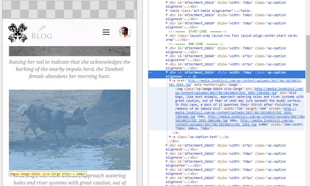
The image below is a screenshot from Chrome inspector using remote USB debugging (so this is actually from a phone, not browser simulation). You can see the image's actual SRC attribute is the correct, smaller version of the image (notice the '-720x480'):
http://media.londolozi.com/wp-content/uploads/2017/08/10130833/DSC_3855-720x480.jpg
However, Chrome on Android has in fact downloaded and is serving the full image. I know this because:
- Images in network tab show status of 200 (not from cache), and are the full sized images
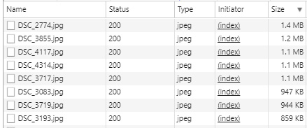
- The image (and post) takes a while to load (I can see the images downloading progressively)
- Pressing and holding to download the image on the phone saves the full image
- Pressing and opening the image in a new tab opens the full size image
Some other things:
- It is correctly only downloading the smaller image on desktop (firefox chrome)
- On every test I fully clear the cache
- The problem still occurs if LINK TO is set to NONE (to rule out the parent
atag'shrefinterfering) - The device width is 420px
- You can see that the 'large' image size has been selected in the Wordpress editor by the 'size-large' class on the image, so the full size should not be downloaded at all
- I have tested this on another wp site and same issue... selecting image size has no effect on chrome android
- You can see it yourself in action here: blog.londolozi.com/2017/08/04/the-week-in-pictures-295/
So I don't know how to explain this behaviour.
Am I correct in asserting that if I explicitly set a size when inserting an image into a post, that the image downloaded by the browser should not be larger than that size, no matter what? Or else setting a size is redundant.
Any ideas why this is happening?