How to make the Primary Menu stay the same in the PC and mobile versions of the Twenty Sixteen theme

I'm new to WordPress, using which I was able to create this site over here: http://wtfai.pl/

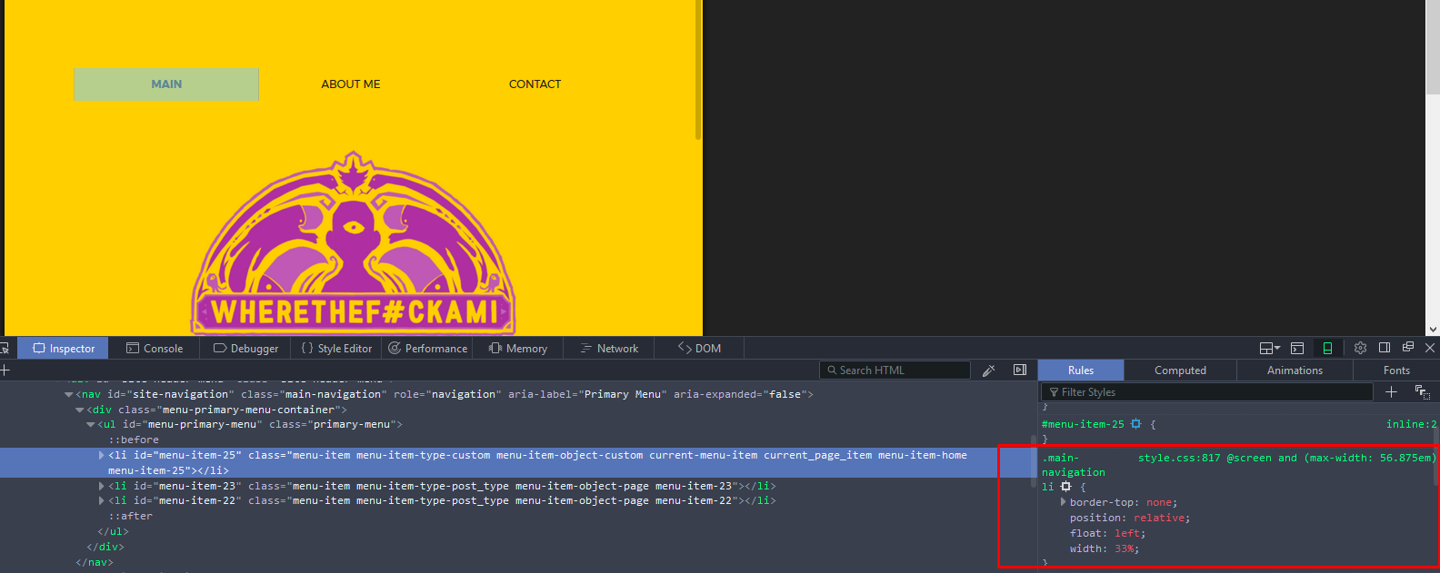
It's almost complete, save for one change I would like to make: to make the Primary Menu stay exactly the same way it is visible now on PCs and mobile devices, so in a single line (it's just 3 positions after all), and aligned to center. I may perhaps want to shrink the text a little bit if it doesn't fit.

Thanks in advance!

Topic theme-twenty-sixteen templates menus Wordpress

Category Web


Add below css in your theme style.css file, change font size if you need

@media screen and (max-width: 56.875em) {
    .main-navigation li {
        float: left;
        width: 33.333333%;
        text-align: center;
        font-size: 12px;
    }
}

UPDATE:

To make menu items inline apply floats on list elements not on nav tag I checked using inspect elements and code i sent works fine. check that rule does not override by any other CSS in hierarchy.

enter image description here

About

Geeks Mental is a community that publishes articles and tutorials about Web, Android, Data Science, new techniques and Linux security.