How to style bootstrap container in wordpress theme?
I am createing the footer.php for my costum theme. 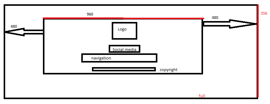
The whole footer is full with/356. In the middle of this container I another container which is 960/252. Inside I have some components(logo, social icons,navigation,copyright). I assume they also should be in separate containers. On a mobile this all should be responsive. Since I am doing my first steps with Bootstrap, I tried to add my custom style. I am changing the style, but than it is not responsive. COuld you give me directions: 1) do I need to place the separate components(loso, social,nav, copy) in different containers? 2) how can I change the style of each container and keep the responsiveness?
My footer.php:
style
#ch {
background-color: yellow;
height: 356;
 }

#chuchu {
 background-color: pink;
height: 252;
width: 960;

}
/style


?php if(!is_page_template( 'blank-page.php' )  !is_page_template( 'blank-
page-with-container.php' )): ?
        /div!-- .row --
    /div!-- .container --
/div!-- #content --
?php get_template_part( 'footer-widget' ); ?
footer id="colophon" class="site-footer" role="contentinfo"
    div id="ch" class="container-fluid p-3 p-md-5"

    div id="chuchu"class="row"
div class="col flex-unordered"
First, but unordered
/div
div class="col flex-last"
  Second, but last
/div
div class="col flex-first"
  Third, but first
/div
Topic sass twitter-bootstrap css theme-development Wordpress
Category Web