Using SRCSET with Images and Featured Images

I have been trying to get SRCSET to load in images for different device sizes.

My understanding is that when the device width or window width changes, that SRCSET will ONLY load the URL of the corresponding size.

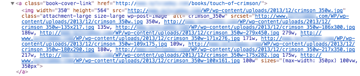
I can see the URLs generating for each image, as well as the sizes. These are all actual images and they link properly to the correct sizes:

This is great! The issue is, I haven’t been able to produce, on any device, proof that the browser is loading anything other than the original (large) image. In other words, that anything is happening with the other, mobile optimized sizes. If I open or save the image in question it’s always the original one. The smaller sizes of image appear not to be utilized at all.

So: is there a Javascript component, or otherwise some kind of configuration setup I’m missing? Something to hook into in WordPress? I’m using a custom theme but notice the same using TwentyFifteen. Is there something I need to register in the functions file? I’m writing this after a lot of research and am still totally stumped what step I’m missing.

Topic retina responsive images mobile Wordpress

Category Web


Browsers which understand the srcset attribute will automatically choose the image which corresponds between the defined sizes and available space. Most of modern browsers support this, older browsers still found in the wild will gracefully fall back and simply use the image linked in the src attribute. There is no additional Javascript needed to activate, the presence of the correct srcset is enough.

If you want to test if your srcset attributes are working the way you expect, you can use the developer tools (normally shown on pressing F12) of your browser. Make the browser window small enough, so one of the smaller versions should be loaded. Open the Network tab of the developer tools, then load the page. Now you see all loaded files and you can check which versions of the images werre loaded. If you now resize the window to a larger size, you should see, that the larger images get loaded additionally.

Another way to visualize which images are getting loaded is to replace the size versions with images of different content directly via ftp, so you can easily spot which one was loaded.

About

Geeks Mental is a community that publishes articles and tutorials about Web, Android, Data Science, new techniques and Linux security.